










There's an adage that "if you can't measure it, you can't manage it," and all of us that are in the business of managing or running things pretty much live by that.
But, how to do you measure something as squishy and ephemeral as an "experience"? And, what experiences are worth managing? At Cisco, we've taken a very focused approach to managing the online experience you have in web, mobile and our social media: We focus on customers' and partners' top tasks and missions with us, and then we measure relentlessly the success, failure and satisfaction on those. This allows us to reduce complex experiences to a set of trackable numbers that we can manage. We take this approach on big things, like the experience of getting support answers online. In fact, usability guru Gerry McGovern explains this approach to "Top Task Management" in a recent article featuring Cisco's Bill Skeet. And we also take the "manage the experience approach" on little things - those simple but important tasks that people do with us every day.
How to Understand, Measure and Fix "Usableness"
Usually, we find that we can improve an experience greatly just by understanding the steps customers are going through and what little things may be tripping them up. We usually find that those "trip up" problems are mix of things that might involve everything from technical issues, to confusing wording, to awkward design. The good news is that all these things are fixable.
Here's a great simple example from our web site: Password reset. You know how simple it is on most sites: You've forgotten your login name or password, so you have the site mail you back a temporary link to reset your password. Except that on Cisco.com it didn't work so well or so simply. So about two years ago, we started running regular usability tests to measure the success and failure that visitors had on the site for this simple tasks. What we found is that for a number of different reasons, about 37% of the people who came to reset their password couldn't do so within five minutes. Yep, you read that right -a simple task that should take a minute couldn't be completed in five. This was something we knew we had to fix!

The culprit, it turned out, was a few technical issues that had crept up over the years, as browser behaviors changed and also as new functions were added to releases. Another set of culprits were confusing instructions and messages that customers couldn't easily comprehend. So sometimes depending on their browser, people saw confusing screens like these:

First Try to Fix
Once we realized what was happening, we jumped in to fix obvious things, and within a few months had lowered the failure rate to 23%.
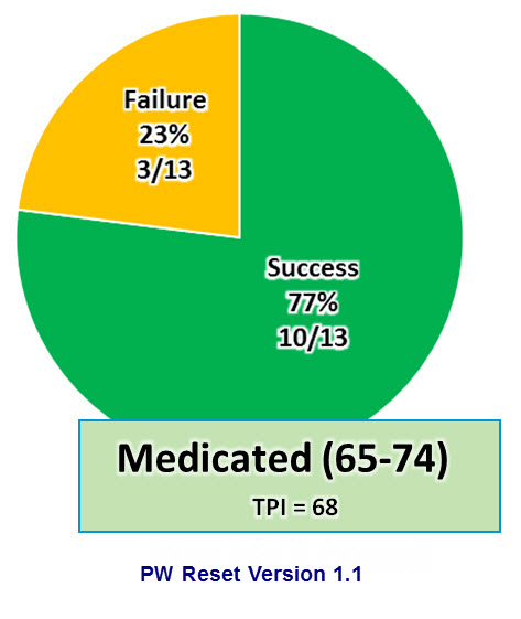
Better, but still not great.
Second Try: Success!
So in ensuring months were pull on the full court press to address all of the major issues that were inhibiting customers from completing this simple tasks. These were sometimes complex systems, and implementing the improvement required coordinated effort from multiple IT teams, usability and experience design people, and even content editors. But we rolled out changes over the summer, and when we rested the experience in December of 2013, we had a very pleasant surprise:
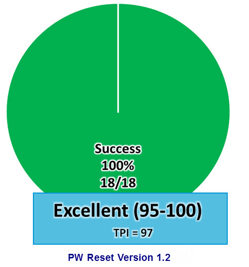
Yes, 100% of the people who did this task completed it successfully. As you would expect it should be. And the way we did this was to measure the experience relentlessly, identify stumbling blocks, fix them and then re-test. It's a simple formula you, too, can follow on your projects to improve the usability of almost any experience
Health and More Detailed Task Performance Measures
By the way, the additional secret sauce of the numbers management we do is something called the "Task Performance Index" or TPI. It measures not only success or failure, but also time on task, confidence and other factors. It's the number we actually manage, and is also tied to the cute medical labels we use for tasks such as "hospitalized" and "medicated."
I'll be writing about the TPI in a future post.
 Tags quentes :
design
digital experience
usability