























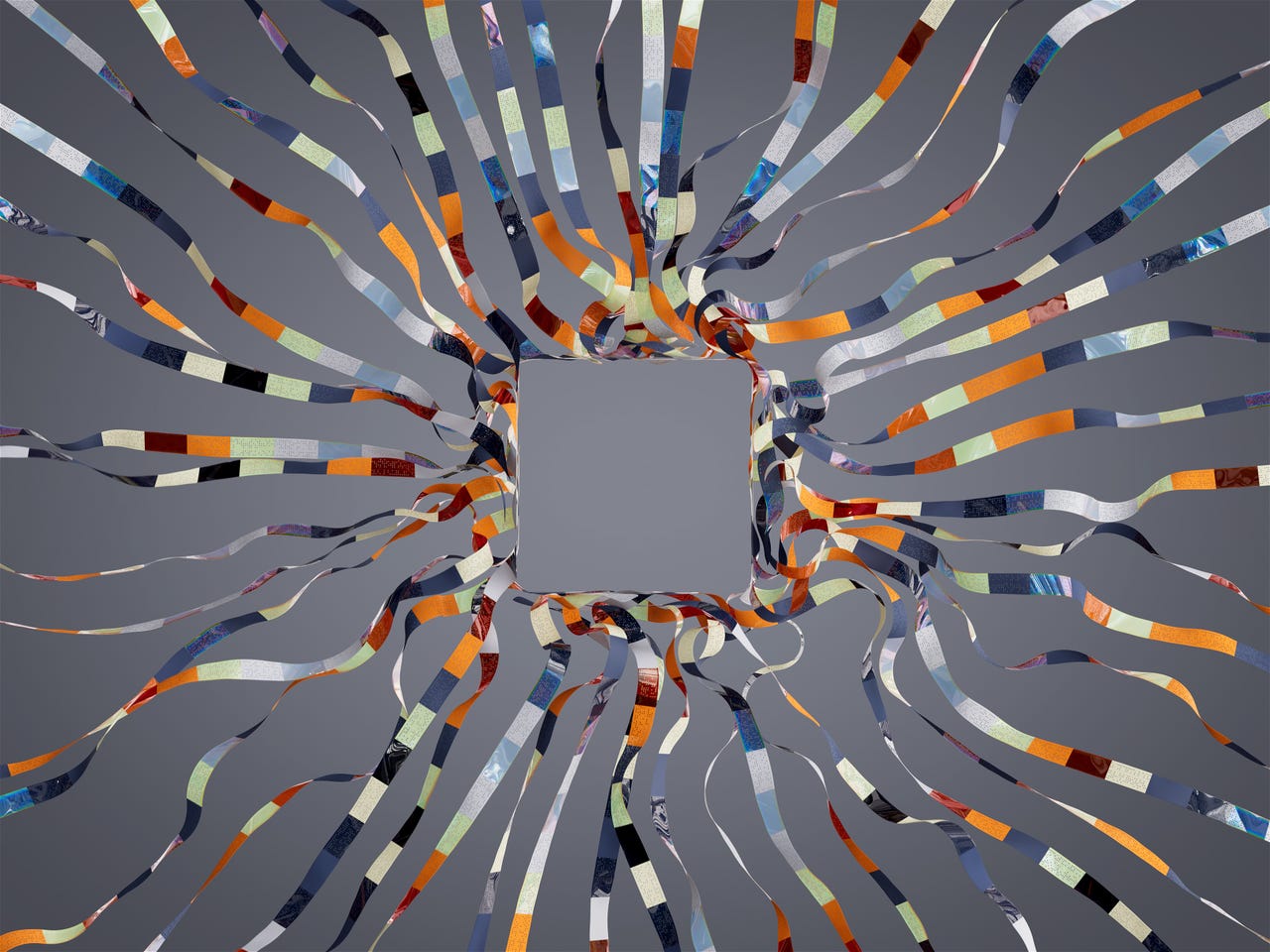
Striking, but what does it mean? The DeepMind images, such as this one, developed by Tim West, are striking, but do nothing to explain what's actually happening in artificial intelligence programs. The image apparently represents "the benefits and flaws of large language models," such as ChatGPT, but how so?
Tim West"Excellence in statistical graphics consists of complex ideas communicated with clarity, precision, and efficiency." -- Edward R Tufte,The Visual Display of Quantitative Information.
Usually, visualization is something meant to help one understand something that cannot be seen. The DeepMind unit of Google has recently published visualizations of artificial intelligence, created by various visual artists. The intention may be a good one, but the results are a disaster.
"Visualising AI commissions artists from around the world to create more diverse and accessible representations of AI, inspired by conversations with scientists, engineers, and ethicists at Google DeepMind," says the company. It contrasts those "diverse and accessible" images to the typical images of AI that include glowing brains or robots and the like.
Also: Generative AI: Just don't call it an 'artist' say scholars in Science magazine
It is true that the typical stock photo images for AI, such as the glowing letters, "A" and "I," do not help anyone understand the rather mysterious art and science of machine learning forms of AI, the dominant form of artificial intelligence.
The famous visualization expert Edward R. Tufte, whose book,The Visual Display of Quantitative Information , was a landmark in understanding visualization, wrote that successful visual displays should, among other things, "induce the viewer to think about the substance rather than about methodology, graphic design, the technology of graphic production, or something else."
Also: Google updates Vector AI to let enterprises train GenAI on their own data
The DeepMind pictures are mostlyonlyabout things such as graphic design. They are an overload of graphic design, in fact.
One image, by Novoto Studio, shows what appear to be tic-tac candies approaching some kind of computer interface. There's nothing in deep learning -- or any other form of AI -- that includes tic-tacs.
Tic-tac, anyone? The DeepMind images, such as this one, developed by Novoto Studio, are striking, but do nothing to explain what's actually happening in artificial intelligence programs.
Novoto StudioThe text accompanying the tic-tacs is equally cryptic. "An electronic device with a lot of small objects on it," it reads. "An artist's illustration of artificial intelligence (AI). This image depicts the potential of AI for society through 3D visualisations." Whatever that means, it probably doesn't have much to do with tic-tacs.
Also: AI's multi-view wave is coming, and it will be powerful
A companion video of the tic-tacs is equally inscrutable, if somewhat mesmerizing. It could be titled "March of the tic-tacs," but that might not help anyone understand AI.
Another image, by Wes Cockx, is supposed to be a "metal structure made of wood and metal," aims to depict "the prediction method used in large language models."
It is a fascinating imaginary structure, but it's not clear what it's doing in predicting. Nor is the companion video, showing the wood-and-metal structure in action, much help. It shows something that looks like an apparatus, perhaps a giant abacus of some kind, but what is that thing doing?
Some of the images are so fanciful they seem to bear no relation to anything at all. One image, by XK Studio, depicting what looks like a cube of some sort of gelatinous stuff, which seems to be shedding other kinds of cell-like gelatinous stuff, is, again, rather captivating, but has nothing to do with AI or anything else. Forced to guess, one might think it's a rendering of a process of gelatin formation.
The video of the gelatinous thing shows lots of stuff forming, which in turn forms other stuff. Again, who knows what stuff is being formed and why?
Also: What is generative AI and why is it so popular? Here's everything you need to know
The companion text explains that the image and video "explores how humans can creatively collaborate with artificial general intelligence (AGI) in the future and how it can offer new points of view, speed up processes, and lead to new territories." Besides not explaining what AGI is, or might be, the text is so vague as to be useless. This is an instance where a picture, and even a thousand words, might not help anyone.
The one image that comes closest to the mark is another by Novoto Studio, which shows what seems to be a branching configuration. The text describes it as, "inspired neural networks used in deep learning."
It's closest to the mark because artificial neural networks can, in fact, be thought of in some senses as branching networks that involve lots of elements in collective activity.
Also: Everyone wants responsible AI, but few people are doing anything about it
In fact, it's odd that the illustrations are all so beside the point, because there is a rich tradition in AI of illustration. The original neural net research work, by Frank Rosenblatt of the Cornell University Aeronautical Laboratory, "The Perceptron," kicked off 60 years of trying to build artificial neural nets. Rosenblatt depicted in his illustration a network made up of artificial neurons. It is beautiful in its simplicity:
It's easy to grasp in a moment a little bit about what's going on because networks of connections run through our lives. Subway station maps show networks of connections. The social graph of Facebook is a collection of connected entities. The graph of connections of anything is powerful -- much more powerful than the strange tic-tac renderings of Novoto Studio and the rest.
One can even turn Rosenblatt's original technical diagram into fanciful images. Such images might not be specific, but they can capture some of the sense of a system that has input and output and produces connections between them:
A neural network transforms input, the circles on the left, to output, on the right. How that happens is a transformation of weights (center), which we often confuse for patterns in the data itself.
Tiernan Ray forThe fundamental problem with the DeepMind images is that the artists seem to understand very little of AI, and therefore, their mission is mainly to give their own uninformed, impressionistic rendering of what they imagine AI to be. That's not particularly helpful if one would like the public to glean something about what's actually going on with AI.
Also: AI goes to Hollywood: Navigating the double-edged sword of emerging technology in storytelling
That's too bad because there are plenty of people working in the field of machine learning who have a solid grasp of the technology and also produce visualizations. The People+AI Research group at Google, for example, has produced some nice visualizations of various aspects of the technology.
An illustration by the People+AI team at Google of the trade-off in machine learning between accuracy and privacy.
Google PAIRA former member of the group, Harvard University professor Martin Wattenberg, is a genuine scholar of visualizing hard ideas. He is famous for, among other things, SmartMoney's Map of the Market developed for the website of the consumer finance publication, which merged into MarketWatch in 2013.
There are people out there who understand AI and can conceivably communicate some of it. There are also people who excel in visual storytelling and explanation. DeepMind seems to have passed them over in favor of design studios that don't know much about either.
 Tags quentes :
Nosso processo
Inteligência artificial
Inovação