












Hand-drawing on a screen is always hit-and-miss, and annotations usually end up looking scribbly and a bit, well, terrible.
This iOS 16 trick will make them look amazing and professional.
OK, take this photo of my morning coffee, and let's say I want to annotate it.
Also:iOS 16: How to get the most out of your iPhone's new lock screen
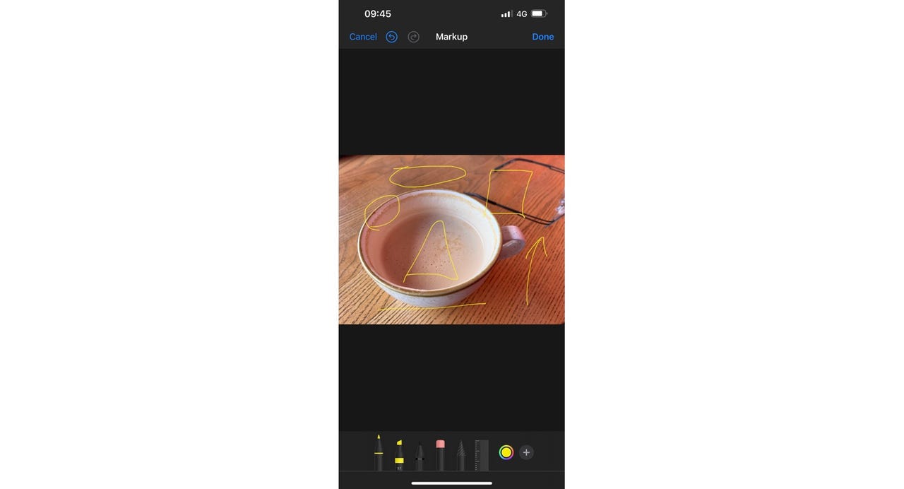
My coffee (badly) annotated.
Adrian Kingsley-HughesIt looks a bit terrible, doesn't it? (Actually, it took me several attempts to get annotations that looked that good!)
But we can make it a lot better.
Here's how.
Here's what the process looks like:
Super tidy annotations.
Adrian Kingsley-HughesAlso: iOS 16 has a hidden Photoshop-like feature. Where to find it and how to use it (and why you're going to love it)
As for what shapes seem to work, here's what I've found:
There are probably more waiting to be uncovered, and Apple will likely improve this feature over time. I'd really like it to be able to make handwriting look better!
While there are other ways to annotate photos and diagrams -- I useTechSmith's SnagIt for most of my work -- for people who want a simple, no-cost solution, this is definitely worth trying out.
 Tags quentes :
Tecnologia
Nosso processo
Serviços & Software
Sistemas Operacionais
SO móvel