We've updated the design of the Cisco.com home page. Not just because we wanted to, but for you. Here's a point by point overview, starting with the desktop/laptop version:

- Same top of page navigation.We've keep the same top of page categories, and "mega menu" navigation, as these work very well today. (Yes, we'll continue to tune these every so often as we have been.)
- Quick Tasks.This new element is based on your feedback about your most important regular tasks on journeys on Cisco.com. Since these items are most important to you, we figured we'd put them front and center for easy access. Expect these tasks to evolve over time as we learn more about how people are using them. And, in the future we'll have different top task lists for Partners, employees and other roles.
- The "marquee."This graphic at the top of the page is a staple of corporate home pages, and we actually toyed with several designs that eliminated it. But in the end, in our testing and reviews, we found that it actually serves a pretty strong purpose to orient visitors and cue them to big announcements or happenings. One innovation: We are personalizing this area, so that over time you may see something different than your neighbor (and more relevant to you).
- Let Us Help.We've added a linkage to chat online or call so you can get information about our products, services and solutions right from the home page. This follows scrolling down the home page, in a way that we hope is unobtrusive.
- Product showcase.Visitors to our site love products, so we've opened up a space to showcase featured products. Here, we have used a "carousel" approach because products have enough of a draw to get active engagement (notice that we dropped the carousel we used to have above on the marquee. But here, we think it adds breadth.)
- Products link.There's a prominent link to a newly designed "All Products" page.
- "Offers."Folks in marketing call these "offers" but you can think of them as showcased items that may be of interest specifically to you. We personalize the list based on what you've expressed interest in previously.
- Watch this space.This is a space for more information that we'll be experimenting with over time.
- News.The new news feed is easier to read, and shows news and announcements from Cisco.
- Blogs and Communities.Some of the most interesting information from Cisco is on our blogs, and the content all of you contribute in our communities. This new component gives us a place to showcase these fresh topics right on the home page.
- Social sharing.Those social sharing widgets you've come to expect on home pages. (This would be a great time to share the new home page if you like it, by the way. )
- The "fat footer."We've made no changes to the fat footer on the page, which has been very effective and helpful and gets 4-6% of the click-throughs on our pages. One question we had was whether visitors would click through, with the longer page. Based on our early usability testing, the answer seems to be yes, and people seem quite engaged in scrolling when they are drilling down to the information they're looking for. We'll be watching the metrics on this area carefully to make sure it's still "discoverable" and well used.
The Smart Phone View
For the mobile view of the home page, the it's the same information, but rendered slightly differently:

- Same header and menu.We've retained the same header and "hamburger menu" as before, as it's been working well
- Let Us Help.The same linkage to chat online or call, but in a more compact form for mobile.
- Quick tasks,in a more compact form.Interestingly, this text only version tested very well for phones, but got lost on the page for the desktop view, so we used icons on the desktop and text for phones.
- Featured Products, in a more compact, swipable form for mobile devices.
- News feedin a compact form.
- Blogs & Communities in a more compact form.
Thanks!
Thanks to all of you who participated in the multiple rounds of testing and have also given use feedback in the last many months -if not years -on your needs for Cisco.com.
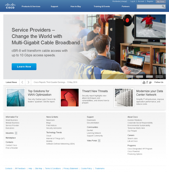
P.S. If the last version of the home page is a distant memory, here's a picture of it:











 Tags quentes :
design
usability
webexperience